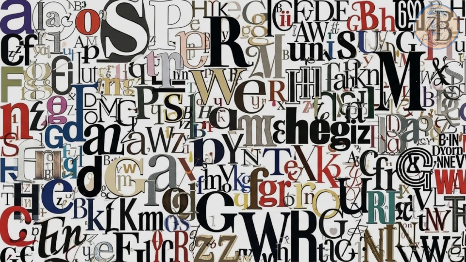
“Before a single word is read, your font sets the tone.”
Typography isn’t just for decoration – it’s the very first impression your writing makes. The typeface you land on decides how audiences view your work, from its mood and professionalism to how easily your words can be read. Whether it’s a full-blown novel, a blog post, or an academic essay, your choice of font subtly communicates who you are as an author before your audience even gets going. In fact, studies have shown that readers form an impression of credibility within 0.05 seconds, with font style and spacing playing a large role in this.
You get our point – a poorly chosen typeface can make even the strongest writing feel amateurish, whereas the right sort enhances tone, flow, and trust. Today at What We Writing, we’re walking you through how to pick the best type of typography for your writing. From comparing sans and sans serif to discovering how typography affects readability, we’ll break down all you need to know to ensure your writing looks as good as it sounds.
What Is Typography?
Typography is the term used to describe the technique of arranging type. This arrangement process involves selecting different typefaces, line lengths, point sizes, letting spacing, line spacing, and manipulating the space between letters (sometimes called kerning).
The art of typography encompasses all of those design elements, the careful combination of which can enhance your written words’ legibility, readability, and overall visual appeal.

Typeface Vs. Font: What’s The Difference?
Whilst people use the words “typeface” and “font” interchangeably, there are actually some distinct differences between the two terms.
Typeface refers to a complete set of characters that are unified by a common design ethos. For example, Helvetica, Garamond, and Comic Sans are all typefaces.
On the flip side, fonts are subsections of typefaces. The font refers to the size, weight, and style of the specific typefaces you’re using. Let’s say you’re writing a book in New York typeface, and you’ve decided to write in New York Condensed Extra Bold size 12. In this case, the “Condensed Extra Bold size 12” part – the style, weight, and type sizes of your typeface – is your font.
The Anatomy Of Typography (And Why It Matters For Writers)
Typography may seem like pure visual art; however, for writers, understanding its structure can drastically change how your words are experienced on the page. Every typeface is built from small design choices that affect how easily readers can follow your text – even if they don’t notice them consciously.
Let’s delve into some key terms:
- X-height: The height of your lowercase letters. Fonts with a larger x-height are generally easier to read in smaller sizes, which makes them perfect for online writing.
- Kerning: As mentioned above, this is the spacing between individual letters. Good kerning ensures that letters feel evenly spaced, whereas poor kerning can make text look awkward or hard to read.
- Leading (pronounced “ledding”): The space between lines of text. Proper leading ensures that your writing is airy and legible; too little makes it cramped, too much breaks reading flow.
- Serif: The small strokes or “feet” at the ends of letters in traditional fonts like Times New Roman. Serifs help guide the reader’s eye across the page, and are typically preferred in printed works.
When these elements work together, they create text that feels balanced, approachable, and easy on the eye. Alternatively, poor typography can make even the best novel in the world feel dense, rushed, or visually off-putting.
Serif Vs. Sans Serif: Which Is Better For Writing?
When deciding on a typeface, one of the first choices you’ll find is whether you want to opt for a serif or a sans-serif font. This decision might seem small, but it can totally change the tone and readability of your writing.
Serif Fonts: Classic, Trustworthy, and Reader-Friendly
Serif fonts are the traditional workhorses of the literary world. They feature small decorative strokes – the “feet” – at the end of letters, which help guide the reader’s eyes smoothly across long lines of text. This is why most printed novels, newspapers, and essays still lean on serif typefaces.
Some popular serif fonts for writers include:
- Garamond – elegant and timeless; perfect for fiction and print manuscripts.
- Georgia – a digital-friendly serif designed for clarity on screens.
- Times New Roman – classic and professional, perfect for formal writing and submissions.
Serifs are particularly hand for long-term reading, where comfort and rhythm are so important. They lend a sense of authority and tradition – perfect if you’re looking for your writing to feel polished or scholarly.
Sans Serif Fonts: Modern, Clean, and Accessible
As the name might suggest, sans serif fonts lack the decorative elements of a serif font. This gives them a more modern look that shines in digital spaces. They’re usually easier to read on screens and mobile devices because their simpler shape holds up well at smaller sizes.
Some of the most common sans serif fonts include:
- Helvetica – clean and balanced, used a lot for professional web writing.
- Open Sans – versatile, easy to read on both screens and in print.
- Lato – friendly yet modern, ideal for blogs or creative portfolios.
Sans serif fonts are best used in online writing, blogs, and social media, where brevity and readability are crucial. They have that fresh, contemporary feel – perfect if you’re looking for your writing to come across as a bit more conversational.
So, which should you choose?
It all comes down to medium and message:
- Writing a novel or essay? Stick to a serif font for warmth and readability.
- Publishing online or on a mobile? A sans serif font will keep your work clean and accessible.
- Creating a personal brand? Try coupling one of each – a serif for headings and a sans serif for body text – to strike a balanced, professional tone.
Ultimately, the best font for your writing is one that supports your words without drawing attention away from them. Allow your typeface to enhance your voice, not compete with it.
Matching Typeface To Writing
Not every font is created equal – looking at you, Comic Sans – and not every piece of writing shares the same goals. The best typeface for a blog may not suit a novel, and what works well for academic writing can feel stuffy in more creative projects. Landing on the right typeface means matching form to function: allowing your typography to serve the tone, genre, and audience of your work.
Here are some of our favourite guidelines to help you pick a font that fits your specific writing purpose.
For Novels and Manuscripts: Prioritise Comfort and Flow
When readers spend hours immersed in your story, comfort is king. Serif fonts are the traditional choice for novels and long-form fiction because their subtle strokes help to guide the reader’s eyes smoothly across the page.
Our choices:
- Garamond – classic, elegant, and gentle on the eyes.
- Palatino Linotype – slightly wider spacing, great for readability.
- Georgia – a serif specifically designed for the screen, making it perfect for digital-first manuscripts.
Tip: Keep your font size between 11-12pt for readability, and stick to consistent spacing throughout the document.
For Blogs and Online Writing: Keep It Clean and Readable
Online readers scan rather than read line by line, so your font needs to feel open, modern, and accessible. Sans-serif typefaces typically perform better on screens because of their simplicity and clarity.
Our choices:
- Open Sans – versatile and friendly across all devices.
- Lato – Stylish yet legible, ideal for lifestyle or creative blogs.
- Roboto – crisp and balanced, perfect for tech or educational writing.
Tip: Couple a bold serif or decorative font for your blog headings with a clean sans serif for body text to create visual hierarchy and professionalism.
For Essays and Academic Writings: Choose Clarity and Authority
Formal documents benefit from fonts that convey reliability and precision. Serif fonts, especially those designed for legibility in print, help maintain a polished, academic vibe.
Our choices:
- Times New Roman – still the standard for most academic submissions.
- Cambria – designed specifically for reading on screens and in print.
- Book Antiqua – slightly softer and easier to read for longer essays.
Tip: Avoid using overly stylised fonts – clarity and consistency are more important than personality in scholarly pieces.
For Personal Branding or Creative Projects: Reflect Your Voice
When your writing represents you – whether that is marketing materials, portfolios, or social content – your typeface can subtly express your personality. Creative professionals tend to mix fonts to balance individuality with professionalism.
Our choices:
- Montserrat – modern and confident.
- Playfair Display – elegant with a classic, editorial vibe.
- Raleway – sophisticated but approachable for creative writers.
Tip: Don’t use more than two fonts together (one for headings, one for the main body). Mixing too many staples can look cluttered and may end up diluting your message.
Your typeface should support your writing’s intent – not distract from it. Whether you’re looking to inspire trust, convey creativity, or invite curiosity, the right font reinforces the emotional and visual impact of your words.
Check Out Our Guide On How To Design A Book Cover That Sells
Tools And Resources For Writers To Test Typefaces
Deciding on a font becomes much easier when you can see your words in action. Thankfully, there are plenty of free tools out there that let writers explore, compare, and test typefaces before they commit to one. So, whether you’re designing a blog, formatting a manuscript, or experimenting with a visual tone, these resources can help you find the perfect match.
Google Fonts
Google Fonts is one of the most accessible places to browse and test typefaces. It offers hundreds of free, web-safe fonts with live previews, so you can type your own text and see how different options look instantly.
Why writers love it: It’s simple, free, and perfect for experimenting with serif vs. sans serif styles side by side.
FontPair
FontPair helps you find complementary font pairings – perfect if you’re designing a blog, newsletter, or eBook. You can browse curated combinations (such as Playfair Display with Lato) and see how they shape up together for headers and body text.
Tip: Use FontPair to identify a consistent “brand typography” across all your writing platforms.
Typewolf
Typewolf is a slightly more advanced resource for writers and designers who want a professional insight into typeface trends. It shows real-world font usage across websites and brands, helping writers visualise what different fonts communicate.
Why it’s great: It’s perfect for refining your personal writing brand or if you’re searching for inspiration for a book cover or blog redesign.
Canva Font Tester
If you already have Canva for visual content, the Canva font tester allows you to experiment with typography directly in your designs. You can mix serif and sans serif fonts, adjust spacing, and preview how your writing looks in promotional graphics or author branding materials.
Tip: Try using Canva to mock up a blog header or book title page – it’s a great way of testing how typeface aligns with your tone.
How to Compare Fonts Visually
When you’re testing out typefaces, compare serif and sans serif fonts side by side using the same sample text. Look for differences in:
- Legibility: How easily can you read it at paragraph length?
- Mood: Does it feel formal, creative, or approachable?
- Tone match: Does the font align with your writing’s subject or style?
Experimenting visually helps you find not only a readable font, but one that feels right for your words.
Wrap Up
Typography might feel like a final flourish, but the reality is that it’s a part of the storytelling process. The right typeface doesn’t just make your writing look good – it also supports the rhythm, emotion, and clarity of your words. When chosen carefully, your font becomes invisible in the best way possible: it allows your message to shine.
Whether you opt for the timeless elegance of a serif or the contemporary confidence of a sans serif, the best typefaces are the ones that match your voice and medium. Remember, consistency builds trust – so once you’ve landed on a typeface that mirrors your writing style, use it across your projects for a cohesive, professional feel.
In the end, great typography isn’t just about decoration – it’s about communication. Allow your words to lead, and let your font quietly elevate them.

James has been passionate about storytelling ever since he could hold a pen. Inspired by the epic fantasy and historical dramas he devoured in his youth, his work now centers on dark, psychological tales featuring intense, introspective characters and atmospheric, gothic undertones. In 2025, he founded What We Writing to share his creative journey and the lessons he’s learned along the way with fellow writers and passionate storytellers.

